Data Detectives
I'm a longtime listener of podcasts and some of my favorite series are by an economist named Tim Harford. His series 50 Things That Made the Modern Economy is great, especially his episodes on clocks and how they eventually led to GPS. His most recent series, Cautionary Tales, is an excellent case study in how people make bad decisions (his most recent episode is all about Florence Nightingale's data visualizations). Tim has a new book out titled The Data Detective: Ten Easy Rules to Make Sense of Statistics. I listened to an excerpt on a recent podcast episode and decided it was worth a read. Seeing as how we all act as data detectives in our geospatial work, I think it's worth sharing just a few of the 10 rules Tim outlines in his book.
Rule 1
Take a moment and read the headline from the news story below.
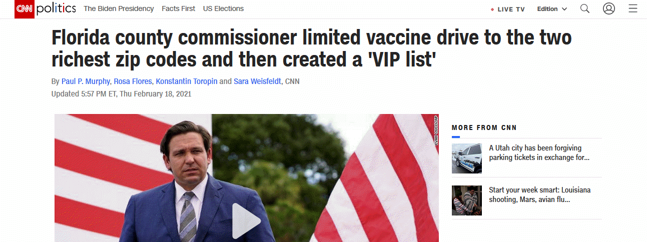
How does that headline make you feel? Are you angry? Are you surprised? Does this headline reinforce your opinions about politicians? Deep down, do you actually like this news story because it proves you’re right and that politicians are scoundrels? For most of us, the answer to all of these questions is yes. And, according to author Tim Harford, that can cause a problem.
Whenever we are presented with information that confirms our attitudes and beliefs, we tend to accept that information without question. At the same time, we routinely seek out any opportunity to discredit information that conflicts with our attitudes and beliefs. This can be a significant problem for those of us who are supposed to use data to make decisions because our emotional connection to the data influences how or if we critically evaluate information.
Rule 1: Search Your Feelings
Tim's first recommendation anytime you are presented with new information is to ask yourself, "How does this data make me feel?". When I first read the news story above I was outraged about the injustice of the rich and powerful skipping ahead in the line, but using what I learned in Tim's book, I paused and tried to disconnect my emotions from the headline. For all I knew, there could be a completely legitimate explanation. So I did what all GIS people do, I downloaded some data and started exploring, looking for other possible explanations.
Were the two zip codes in the news story (highlighted in bright blue in the map below) the actual two richest in the county? It wouldn't be the first time a reporter made a mistake and presented the wrong information.
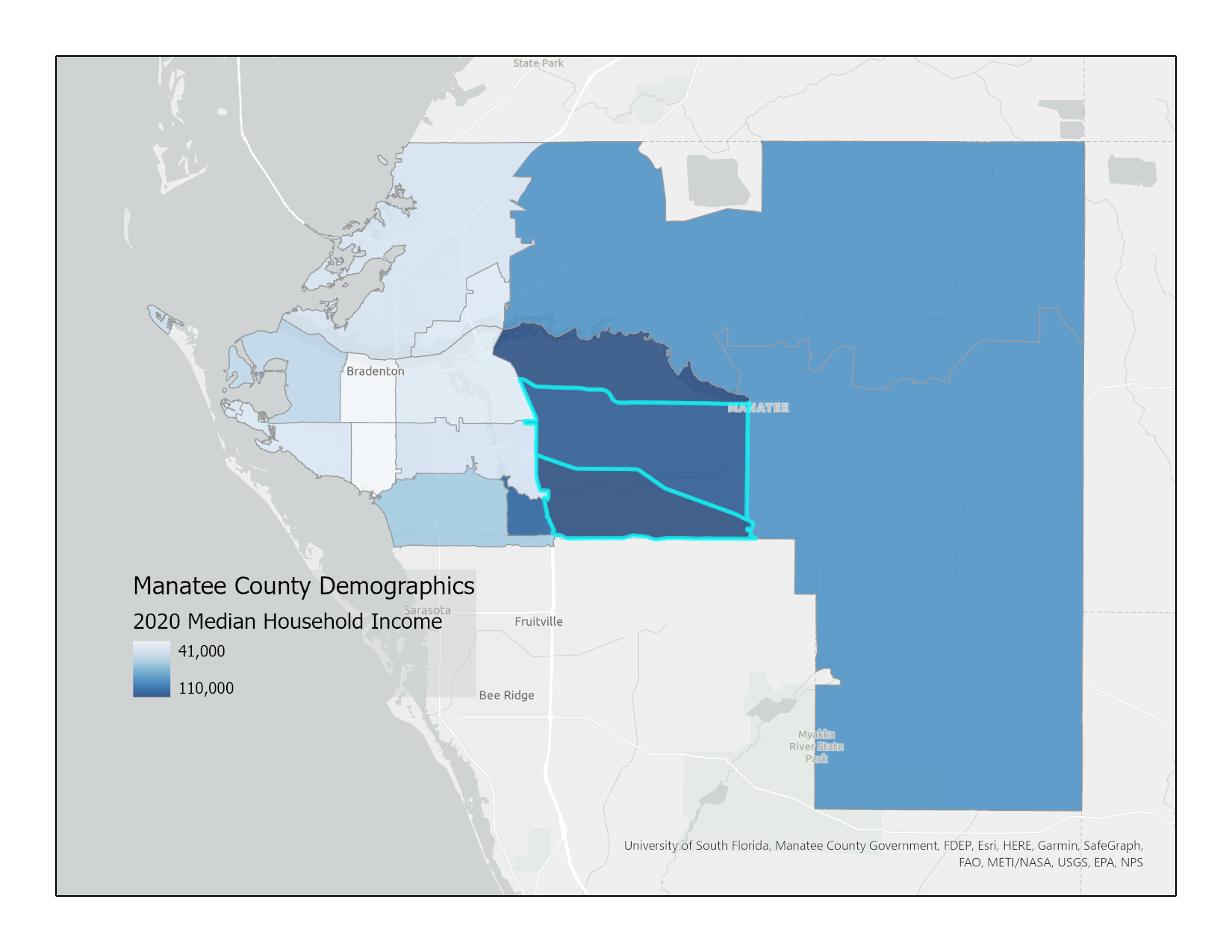
According to 2020 ESRI median income estimates, the top three zip codes in Manatee County Florida have income ranges from $103,000 to $106,000. The two zip codes mentioned in the news article are ranked #1 and #3. That is close enough to the article that I can probably explain the difference as a result of using estimates from the US Census rather than from ESRI. But if the county commissioner was really focused on only the wealthy, why didn't she pull any names from the other very wealthy zip code?
What about population density?

We all know that Covid-19 is likely to spread faster in areas with higher population density. Maybe those two zip codes are denser areas within the county? Actually no, they are two of the least dense zip codes in the county.
Rule 4
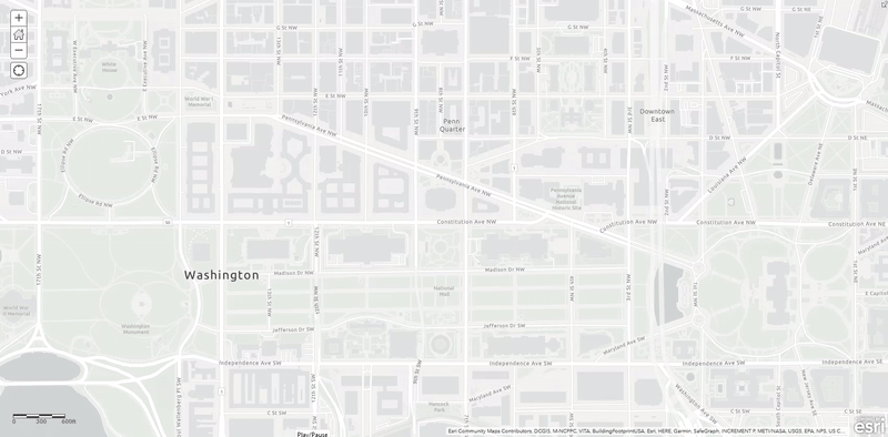
Each step in the video below is 10 minutes worth of points. The data is from a 12 hour period on January 6, 2021 from about 8:00 am – 8:00 pm Eastern Time. The points were created from embedded geotags and time stamps from Parler video posts.
Like all of you I watched in horror as the US Capital was stormed, elected officials hid in basements and bunkers, and law enforcement officers fought for their lives against a crowd bent on destruction. Watching the events of January 6 unfold in real time, I started to wonder what the future of America held if it was this easy to disrupt our peaceful transition of power. For me personally, I was reminded of the fear and uncertainty I felt on 9/11.
Rule 4: Step Back and Enjoy the View
Tim's fourth recommendation is to step back and put the information you are seeing in context. His favorite strategy is to relate the numbers you are seeing to something you are familiar with. So that's what I did. 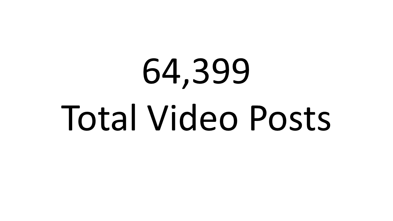
The metadata I downloaded contained a total of 64,399 Parler video posts from the entire world. Is that a lot? At first it seems like it, except that number is for the entire 10 year history of Parler. Parler is a social media app, so let's compare it to a more popular app like Twitter for some additional context.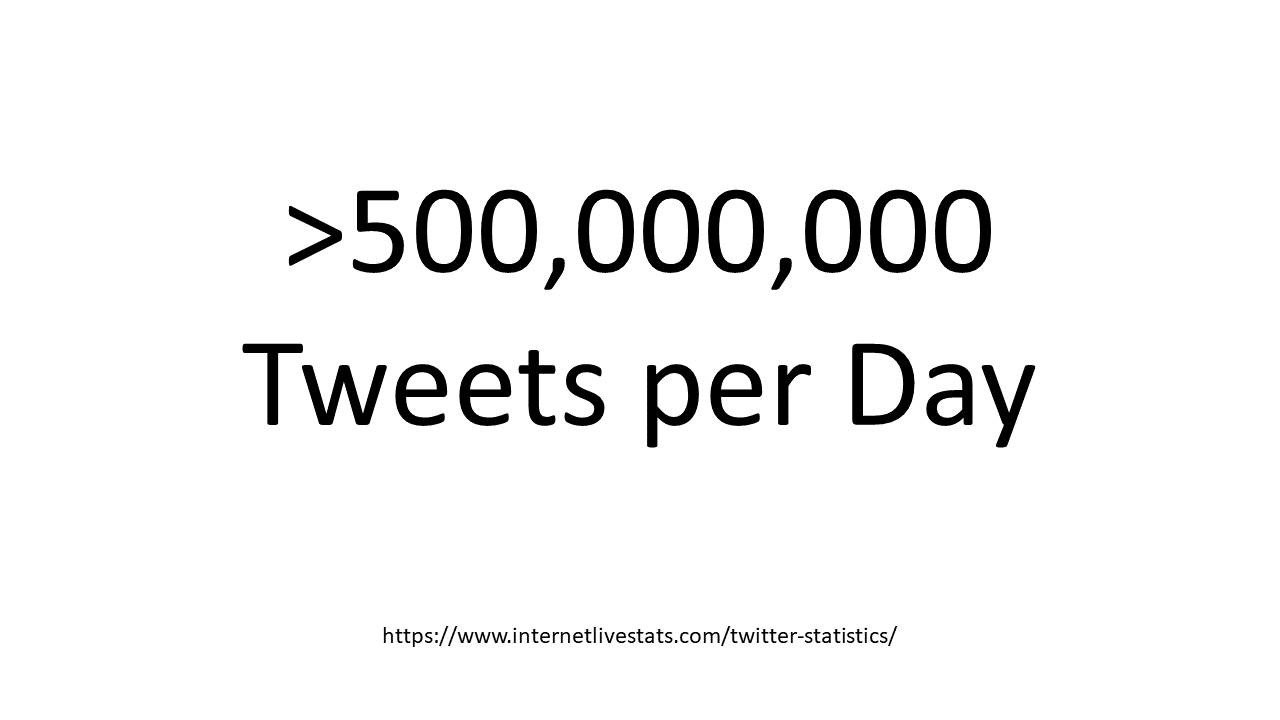
According to Internet Live Stats, there are more than five hundred million tweets per day on Twitter. I can't even wrap my brain around that number. Let's try one more time.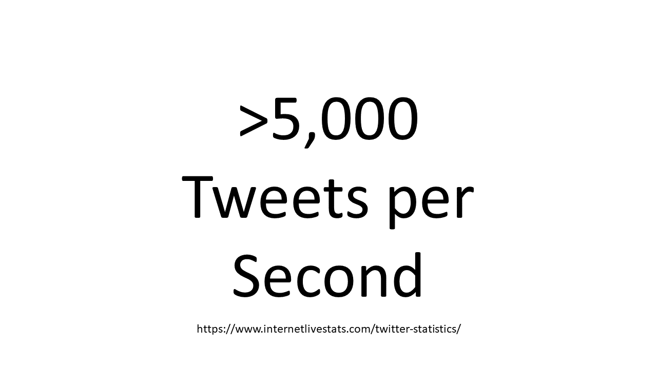
That averages out to more than 5,000 tweets per second. It would take about 13 seconds for the number of tweets to outpace the entire history of Parler video posts. Does knowing the relationship between Parler video posts and Twitter influence your perceptions about the events of January 6? Let me show you one more graphic.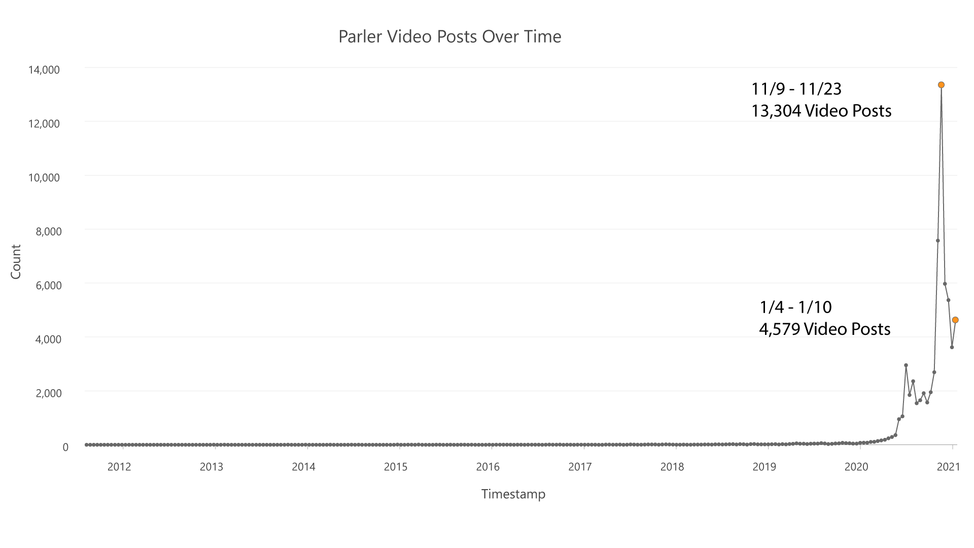
Here is a chart of Parler video posts over time. Each point represents two weeks worth of posts except for the last point which represents the week when Parler was shut down. The far right orange dot contains the week of January 6. The total number of posts that week pales in comparison to the two weeks after the November election indicated by the orange dot at the peak of the chart. While all of us were glued to our news sources on January 6, maybe we should have been paying closer attention before that.
We are constantly bombarded with news stories, social media posts, and all manner of communication that contains data. And with every headline we read, we have to decide what, if anything, to do with that information. I hope these two rules will help you make better sense of the world around you.
Find a copy of Tim Harford's The Data Detective if you'd like to learn about his other 8 rules for making sense of statistics.
Stay safe and normalize your choropleths - MC